Step 8: Save your Work
Save Figures for Notebooks
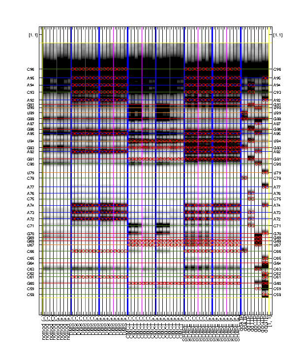
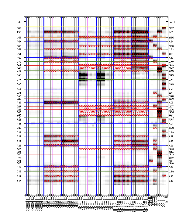
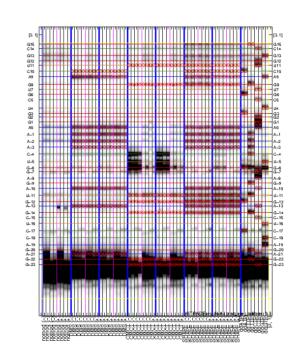
Saving analysis figures for future reference is good in the long term. Most intermediate functions of HiTRACE pipeline generates figures. For example, quick_look() automatically saves 5 figures to Figures/ folder. For the ones that do not do so already, use command print_save_figure():
print_save_figure(gcf, 'fig_name', './');
It saves the current figure (gcf) to a .eps file in the current directory (./). Another useful function for resizing figure to a letter paper size is set_print_page().
Multi-Page Print-Outs
It is rewarding to archive your sequence assignment since you spent so much time on it! HiTRACE provides a graphic function for figures like the overview:
labels = data_types;
for i = 1:length(labels) - 8;
    if i <= 8;
        if mod(i - 1, 8) < 4;
            labels{i} = [labels{i}, ' (-)'];
        else
            labels{i} = [labels{i}, ' (+)'];
        end;
    else
        if mod(i - 9, 16) < 8;
            labels{i} = [labels{i}, ' (-)'];
        else
            labels{i} = [labels{i}, ' (+)'];
        end;
    end;
end;

print_xsel_split(d_align, xsel(2:end), seqpos_out, sequence, offset, area_pred, labels, ...
    [3 0 0 50 75 100 4 8 52 0 8 56], [0 1 0 1 1], ...
    {'RNA Puzzle #13: ZMP Aptamer', '', '', 'T47', 'May 2015'}, [25 15 9 8 11 1 1 2]);
The above code first prepares the labels which includes '(-)' and '(+)' for ligand conditions. The function print_xsel_split() saves multiple .eps files.
xsel(2:end)gives all the band positions. The first value inxsel, which is the full-length extended band, is excluded since it does not correspond to any nucleotide position insequence.
The arguments on second and third lines are totally optional. It offers finer adjustments on the image, borders, and texts. Checkout
help print_xsel_splitfor detail specs.
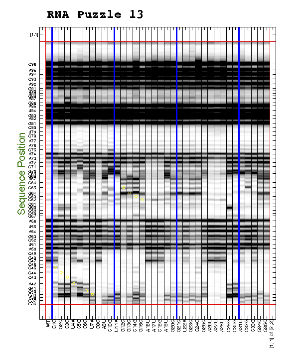
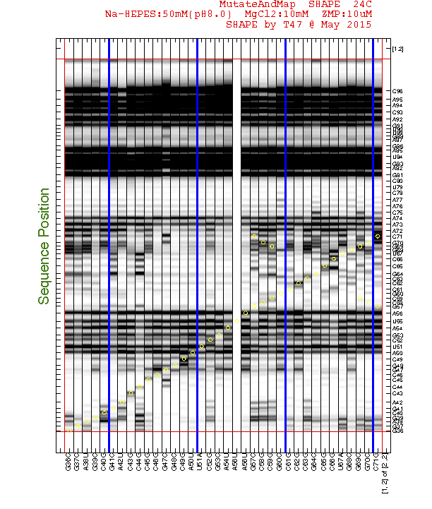
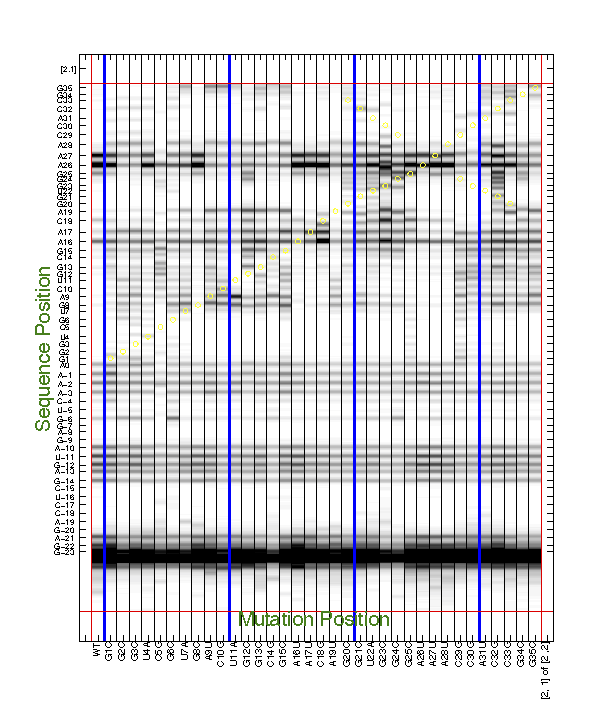
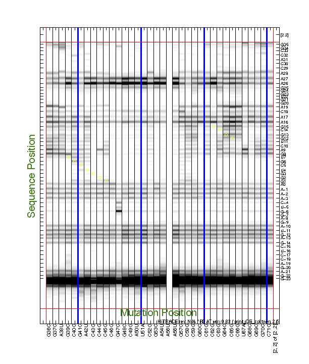
For the 2D data, we often need to find interesting features by eye, e.g. to discover mutants that perturb a certain region. This also requires printing the entire data (d_align) larger than a single page. We have a command to do this:
d_align(:, 56) = 0;

print_CE_split(d_align, d_rdat, [], [], xsel, [], [], area_pred, ...
    [2 2], [1 0 1 1 1 1 1 0 1 1 1], ...
    {'', 'print_CE_split_output', 'SHAPE', 'T47', 'May 2015'});
Similar to print_xsel_split(), the command print_CE_split() takes a lot of options too. Note that you need an RDAT object d_rdat before calling this function. Saving RDAT files is explained in Step #9. We blanked the bad lane for print-out here.
Now you can splice them together into one giant print-out!
Cut the right margin for columns that are NOT the last (right) column.
Cut the bottom margin for rows that are NOT the last (bottom) row.
Data Visualization matters!
Good data visualization assists data interpretation greatly. Here we briefly show some of the ways to plot the reactivity data and make comparisons.
Familiarize with built-in functions like
plot(),errorbar(),scatter(),bar(),image(),colormap(),subplot(),axis(),legend(),title(), etc.
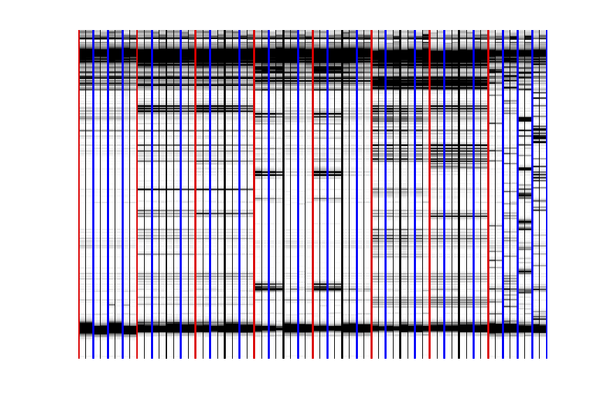
From time to time, you may need to show the data in heatmap style. How to make a figure that is like what we have seen in quick_look()? Here is a quick example:
image(d_align(501:3000, :) * 20);
colormap(1 - gray);
axis off;

make_lines;
make_lines(0:2:64, 'b', 2);
make_lines(0:8:56, 'r', 2);
make_lines(12:8:56, 'k', 2);
It makes an image for a part of d_align in black/white heatmap, and draw lines to separate lanes.
We used
* 20to adujst the darkness of the image. This number is not fixed. Try several to achieve the best contrast.colormap(1 - gray)defines the black/white color scheme.
The HiTRACE package includes a handy function
make_lines()that can make vertical lines with styles. Also check outmake_lines_horizontal().
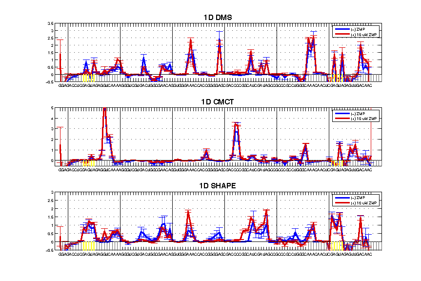
As mentioend in Step #7, here is the script for making a figure like this:
The code is here and we will break it down for you:
figure();
set_print_page(gcf, 0);

subplot(3, 1, 1);
plot(seqpos_out, d_DMS_minus, 'b', 'linewidth', 2); hold on;
plot(seqpos_out, d_DMS_plus, 'r', 'linewidth', 2); hold on;
errorbar(seqpos_out, d_DMS_minus, da_DMS_minus, 'b'); hold on;
errorbar(seqpos_out, d_DMS_plus, da_DMS_plus, 'r'); hold on;
make_lines_horizontal(-0.5, 'k');
make_lines([min(seqpos_out):0, 72:(max(seqpos_out) + 20)] - 0.5, [0.4 0.4 0.4], 0.5, 1, 0);
make_lines(ref_peak - 0.5, 'y', 1.5, 1, 0);
axis([-25 100 -0.5 3.5]);
legend('(-) ZMP', '(+) 10 uM ZMP');
title('1D DMS', 'fontweight', 'bold', 'fontsize', 15);
set(gca, 'xgrid', 'off', 'ygrid', 'on');
set(gca, 'xtick', [seqpos_out, first_RT_nucleotide + 1:20], 'xticklabel', sequence', 'fontsize', 8);
make_lines([-20:20:100] - 0.5, 'k', 0.5, 0, 1);

subplot(3, 1, 2);
plot(seqpos_out, d_CMCT_minus, 'b', 'linewidth', 2); hold on;
plot(seqpos_out, d_CMCT_plus, 'r', 'linewidth', 2); hold on;
errorbar(seqpos_out, d_CMCT_minus, da_CMCT_minus, 'b'); hold on;
errorbar(seqpos_out, d_CMCT_plus, da_CMCT_plus, 'r'); hold on;
make_lines_horizontal(-0.5, 'k');
make_lines([min(seqpos_out):0, 72:(max(seqpos_out) + 20)] - 0.5, [0.4 0.4 0.4], 0.5, 1, 0);
make_lines(ref_peak - 0.5, 'y', 1.5, 1, 0);
axis([-25 100 -0.5 5]);
legend('(-) ZMP', '(+) 10 uM ZMP');
title('1D CMCT', 'fontweight', 'bold', 'fontsize', 15);
set(gca, 'xgrid', 'off', 'ygrid', 'on');
set(gca, 'xtick', [seqpos_out, first_RT_nucleotide + 1:20], 'xticklabel', sequence', 'fontsize', 8);
make_lines([-20:20:100] - 0.5, 'k', 0.5, 0, 1);

subplot(3, 1, 3);
plot(seqpos_out, d_SHAPE_minus, 'b', 'linewidth', 2); hold on;
plot(seqpos_out, d_SHAPE_plus, 'r', 'linewidth', 2); hold on;
errorbar(seqpos_out, d_SHAPE_minus, da_SHAPE_minus, 'b'); hold on;
errorbar(seqpos_out, d_SHAPE_plus, da_SHAPE_plus, 'r'); hold on;
make_lines_horizontal(-0.5, 'k');
make_lines([min(seqpos_out):0, 72:(max(seqpos_out) + 20)] - 0.5, [0.4 0.4 0.4], 0.5, 1, 0);
make_lines(ref_peak - 0.5, 'y', 1.5, 1, 0);
axis([-25 100 -0.5 3]);
legend('(-) ZMP', '(+) 10 uM ZMP');
title('1D SHAPE', 'fontweight', 'bold', 'fontsize', 15);
set(gca, 'xgrid', 'off', 'ygrid', 'on');
set(gca, 'xtick', [seqpos_out, first_RT_nucleotide + 1:20], 'xticklabel', sequence', 'fontsize', 8);
make_lines([-20:20:100] - 0.5, 'k', 0.5, 0, 1);

print_save_figure(gcf, '1D_plot_compare', './');
To walk you through, the code draws 3 subplot() panels. For each panel, it:
plot()the (-) and (+) reactivity in solid lines. And then add theerrorbar().
You need to
hold ononce for each panel, otherwise eachplot()orerrorbar()function will overwrite the figure.
-
It draws gray shadow lines for the 5′ and 3′ flanking sequences, and yellow lines for the GAGUA reference loops. Note that some of the numbers here are hard-coded.
-
It limits the x-axis and y-axis window, then sets the legend, title, and x-axis tick labels with the
sequence. Also it sets the grid options and x-axis grid at every 20 (manually).
